61/100
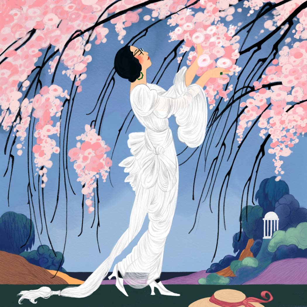
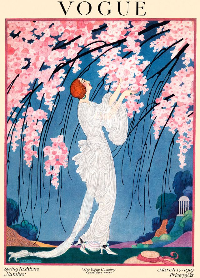
Vogue cover, March 15 1919
-
Artist
Helen Dryden
-
Year
1919
-
Culture
American
-
Date of Copy
At this point in the project, I decided to give every 10 entries a theme. The theme of entries 61-70 was illustrated, "flat" styles that relied on line rather than light and shade. Besides liking how this style looked, I figured it would be faster to copy than the fully rendered and shaded paintings I'd been doing earlier, which had slowed me to a glacial pace.
Was it faster? Yes, technically, but I have to say it still wasn't as fast as I expected. There was less detail to render, but the lineart was very precise, which it turns out also takes a fair amount of time to get right. I did learn a lot and got to look at a lot of beautiful illustration, so it was definitely still a success.
Fashion illustrations from the early 1900s really appeal to me. They're pure fantasy, conjuring up a sense of leisure and ease. They often also have a sense of humor. Now that I think about it, they're spiritually reminiscent of the Rococo aesthetic. Stylistically, they look similar to classic fairy tale illustrations.
This one is taken from a 1919 Vogue cover, by Helen Dryden. As I was painting this in the cold wintry grey month of February, it gave me a much-needed infusion of springtime energy to look forward to.
Reference image from this blog post on Covers of Vogue in the 1910s.

